
After a decade or more when monochrome minimalism held sway, it has been refreshing to see the world’s leading tile manufacturers start to explore colour with fresh enthusiasm. This has gone hand in hand with the revival of small format wall tiles. It is clear that the use of colour is now far more scientific and considered that it was, say, 20 years ago.


My perception is that tile design studios are now placing as much emphasis on the final installation as they are on the potential buyer’s perception of the tile ranges themselves. I am increasingly seeing multiple designs, across both wall and floor tile range, that have been developed using compatible colour systems. This often results in ton-sur-ton collections that marry a few closely related hues across stone-, wood-, and concrete-effect tiles. These design can then be mixed and matched at will, as the user knows that the end result will always look balanced and in harmony.

Manufacturers are also returning to tried and tested colour theories and palettes: seeking contemporary inspiration from historical precedents. The outstanding example in recent years was the LCS collection by Gigacer that was based on the colour philosophy of Le Corbusier as outlined in an essay entitled “Polychromie Architecturale”. Twelve of the 63 colours referenced in this seminal work featured in this ground-breaking porcelain tile collection. In an era where ceramic tiles are really starting to provide architects and interior designers with more than just an alternative surface finish, Gigacer’s collection demands the specifier’s attention and comes with a fully realised intellectual thesis that has already stood the test of time.


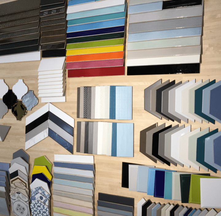
Other manufacturers are equally investing in sophisticated colour theory to create strong palettes that are far more than a mere range of different colour options. Here I will concentrate on images from Tonalite, since this manufacturers carefully curated use of colour really caught my attention at Coverings.

Some of today’s tile ranges are based on harmonic colour combinations formed from complementary colours, such as primary yellow, red and blue. They are the highest expression of colour contrast and generate a vibrant energy. Manufacturers are also using organic vitamin colours to deliver a fresh chromatic energy particularly in large-scale applications.

Recent tile exhibitions have also seen unexpected tonal colour combinations, such as blue with blue-green, or orange with red. These analogous colours share a common base colour and, when juxtaposed, create dynamic yet quite delicate compositions that can be both expressive and surprisingly elegant.

Possibly the dominant tile colour trend in recent years has been the emergence, as noted earlier, of monochromatic ton-sur-ton colour schemes. Here the choice of hue is carefully calibrated. The dominant colour, expressed in a variety of shades, becomes a common thread that allows for the juxtaposition of different styles of tiles, and different surface textures, while maintaining an overall sense of order. Playing to the Scandi notion of hygge, recent tile exhibitions have seen a predominance of pale, warm tones that evoke a sense of calmness and sanctuary. These palettes result in very versatile spaces that allow furniture and fabric to add the pop of brights if required.

One clever way tile manufacters have brought these different colour trends together is by creating palettes that share a common base tone and saturation, often from the grey spectrum. This creates tiles with a similar depth and intensity, allowing both harmonious ton-sur-ton conbimations or more dramatic colour contrasts to be achieved with the same palette.

Of course, manufacturers also want to shock and surprise, and here the antidote to monochrome safety is pastiche: ranges where it is all but impossible to discern any colour code, or ones that rely on mix and match melanges for visual impact. The resultant look is spontaneous and free; often blending the past with the present.


In an age when colour fashion is constantly changing, such as today’s trend for wider complimentary colour spreads – say buttermilk and ochre – it is great to be able to call on a company like Tonalite for palettes that guarantee harmony.
A new post by Joe Simpson, Diary of a Tile Addict, May 2018.
Joe,
You have been doing a great job on showing us the styles, current direction and techniques that highlight the relevant trends… I always look forward to seeing your posts. Keep it up! Curt Rapp CEO Tile Doctor
thanks a lot 👍
Inviato da iPhone
>