

Marianne Smink designs and makes screen-printed ceramic tiles, and digitally-printed wallpapers. Her aim is to achieve beauty through the inherent imperfection of hand-made work, drawing on the Japanese philosophy of wabi-sabi. It was a great pleasure to profile (in Tile & Stone Journal) this dynamic Dutch-born designer who is fast making a name for herself through her company Smink Things (now Smink Studio).

Marianne Smink, the brains behind Smink Things, learned the craft of print design during her time at fashion school in the Netherlands. She then worked for several years in high street fashion before starting to look for ways of working that valued the uniqueness of the final product rather than its conformity.
After moving to London, and completing an MA in Applied Imagination at Central St Martins, Smink began working with traditional processes to develop products that celebrated subtle imperfection.
Through experimentation and a constant search for inspiration, she aims to allow beauty to emerge in every piece. This has led to her current collection of ceramic wall tiles, concrete floor tiles and wallpapers.
The ceramic wall tiles are hand-cut and screen-printed. Through extensive experimentation with clay bodies, glazes and firing techniques, Smink has developed a distinctive portfolio of ceramic tile designs. These tiles can be used for small surfaces, like splashbacks, but also can be used to create dynamic feature walls. All the tiles are all made to order, and Smink Things also undertakes individual commissions. Larger projects are also undertaken, working in collaboration with a Portuguese tile factory.
Smink started by producing all the tiles (cutting and printing) by hand at home. The company now buys in hand-made tiles from Portugal ,and prints and fires them in the UK.

“My personal favourite is Going Overground,” says Smink, “which was inspired by the way tiles were used in London underground stations in Victorian times. The tiles served the dual purpose of decoration and signage. The unique patterns in each station helped illiterate passengers to know where to get off. I love the elegance of these slim, rectangular tiles and how they can be put together in different compositions creating unexpected patterns and colour groups.”

To enable clients to create cohesive interiors using her tiles, Smink Things also produce a range of wallpapers that take the tiles as their recurring motif. Elegant and understated, the wallpapers offer a twist on tradition. The result is a small and carefully thought-through range of interior design products that can stand in isolation or work in harmony with each other.
Treff Magazine captured the appeal of the designs when it noted: “Ceramic tile artist Marianne Smink of Smink Things applies wabi-sabi (the Japanese aesthetic acceptance of imperfections) with a breathe of Dutch sensibility. It’s all completely purposeful with twinkle of distinct charm.

Smink looks far and wide for inspiration, from derelict chapels to L S Lowry’s industrial cityscapes. Each tile has an effective distressed aesthetic that is perfect for adding a cool industrial edge to any interior design scheme.

Her designs are firmly at the cutting edge of commercial tile production, where geometric encaustic and distressed decors inspired by abandoned warehouses are now recurring motifs in collections by Refin and other design-led factories.
The Quarter Circle tiles feature, in Smink’s words: “The simple but sharp outline of a quarter circle, only subtly visible against a loosely painted background. Together the quarters enhance each other and emerge from the square tiles, starting a circular life of their own. They can be arranged to create full circles or to snake across a wall like a pattern gone wrong, trying to escape itself. They have a flag-like simplicity, a banner for unity in disorder.

Quarter Circle tiles are available in two colourways: one a brightly-coloured combination of blues, reds and natural white; the other a more muted combination of greys and browns. Both allow the striations and imperfections of their handmade production method to show through in beautiful detail. Each screen-printed tile is handmade and comes in a 140 by 140mm format
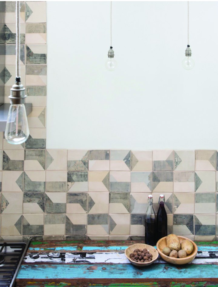
After Lowry tiles are abstract designs that are directly inspired by iconic English painter L S Lowry’s depictions of northern England’s industrial landscapes. “They are some of the most instantly recognisable images of England and I wanted to reflect Lowry’s colour palette but also filter it through my ‘Dutch eyes’, says Smink. “The result is a composition of colour and glaze that has consistently been one of the most popular Smink Things tiles. The angled blocks of greys, browns and creams create surprising surface patterns in a similar way to Lowry’s city vistas. There is randomness and order in both which can be recreated by arranging the tiles in different patterns.”
Each tile measures 140 by 140mm. Smink offers the pattern as a wallpaper, and has also used this design as the basis for a range of concrete floor tiles.
“Just like our After Lowry wall tiles, these are inspired by the paintings of L S Lowry and, in particular the industrial buildings in his paintings of the north of England, such as Coming From the Mill,” says Smink.
“The angled blocks of greys, yellows and creams in these tiles create surprising and varied surface patterns in a similar way to Lowry’s city vistas. There is randomness and order in both.”
These 200 by 200mm concrete floor tiles can be laid in many ways to create surprising and varied patterns.
The subway-style Going Overground tiles were inspired by the London Underground, “the most extensive tiling project ever undertaken in Britain,” notes Smink. The tiles come in a 300 by 100mm rectangular format and apply London’s above-ground colours to a tile associated with the Tube.

Going Overground tiles are brick-shaped pieces that take their inspiration from the most extensive tiling project ever undertaken in Britain, the London Underground. Prior to universal literacy in Victorian and Edwardian times, the patterns created by clean and simple station tiles were a substitute for name signs. Re-imagining the rhythmic patterns that those shapes and lines can create has resulted in the Going Overground range. The grey colourway is a ‘cooler’, perhaps even colder alternative to the original warm yellows and oranges. The tiles come in a 300 by 100mm rectangular format.
“One of the simplest tile designs I can think of is the chequered layout of black and white tiles. From Victorian bathrooms to Art Deco halls to 1980s kitchens, it has been a staple design choice. What inspired Squared was the desire to play with that form while keeping the tile as simple as possible. I eventually achieved this with a combination of subtly distorted pattern and colour,” explains Smink.

“There are only two different tiles in the Squared collection: white with a black block, and black with a white block. The black is screen-printed by hand onto the tile in a special combination of glazes to create a rich, lunar depth and texture. This combination of colour and form produces a range of edgy, almost random patterns. These tiles subvert expectation and impose disorder. Like many Smink Things designs, the overall look depends on how you lay the tiles out, so order can, if you choose, be re-established,” explains Smink.

Bringing a sense of fun to the interior, Morphing Cranes plays visual tricks on the viewer. When the tiles are put together the cranes’ wings start to look like feathers and the tiles’ abstract qualities emerge. This allows everyone to see something different in the pattern.

Morphing Cranes tiles were inspired by Art Deco and with their handmade, screen-printed production processes they feel aged and worn, or perhaps discovered and restored. Each screen-printed tile is handmade and comes in a 140 by 140mm format.
Wabi-sabi: finding beauty in imperfection
Emerging in the 15th century as a reaction to the prevailing aesthetic of lavishness, ornamentation and rich materials, wabi-sabi is the Japanese art of finding beauty in imperfection and profundity in earthiness, of revering authenticity above all.
Broadly, wabi-sabi is everything that today’s sleek, mass-produced, technology-saturated culture isn’t. It is flea markets, not shopping malls; aged wood, not seamless floor coverings. Wabi-sabi celebrates cracks and crevices, rot and all the other marks that time, weather and wear leave behind. To discover wabi-sabi is to see the singular beauty in something that may first look decrepit and ugly.
Wabi-sabi reminds us that we are all transient beings; that our bodies, as well as the material world around us, are in the process of returning to dust. Nature’s cycles of growth, decay, and erosion are embodied in frayed edges, rust and liver spots. Through wabi-sabi, we learn to embrace both the glory and the melancholy found in these marks of passing time.
Rough textures, minimally processed goods, natural materials, and subtle hues are all wabi-sabi. Consider the musty-oily scene that lingers around an ancient wooden bowl, the mystery behind a tarnished goblet. This patina draws us with a power that the shine of the new doesn’t possess.
There is no right or wrong to creating a wabi-sabi home. It can be as simple as using an old bowl as a receptacle for the day’s mail, letting the paint on an old chair chip, or encouraging the garden to go to seed. Whatever it is, it can’t be bought. Wabi-sabi is a state of mind, a way of being. It’s the subtle art of being at peace with yourself and your surroundings.
Wabi-sabi content by Robyn Griggs Lawrence, Editor-in-Chief, Natural Home
This profile of Marianne Smink first appeared in Tile & Stone Journal, September 2015.
One thought on “Inherent Imperfection”